Initial-Letter style for a Grid Layout
How could we achieve the following using CSS grid? This question was originaly asked on Stack Overflow.
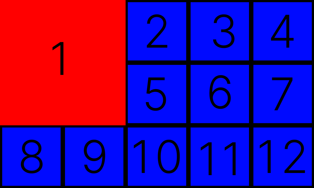
Here is my answer:
The HTML here is quite boring:
<div>1</div>
<div>2</div>
<div>3</div>
<div>4</div>
<div>5</div>
<div>6</div>
<div>7</div>
<div>8</div>
<div>9</div>
<div>10</div>
<div>11</div>
<div>12</div>
but the CSS is where the fun is:
body {
  display: grid;
  gap: 10px;
  grid-template-columns: repeat(5, 1fr);
  background: black;
}

div:first-child {
  grid-column: 1 / span 2;
  grid-row: 1 / span 2;
  background: red;
}

div {
  display: grid;
  place-items: center;
  font-size: 72px;
  aspect-ratio: 1;
  background: blue;
}
How it works:
- Establish a block-level grid container.
- The grid-template-columns property sets the width of explicitly defined columns. In this case, the grid is instructed to create column of equals size, and repeat the process 5 times.
- The aspect-ratio property sets the height to be a square.
- The gap property sets the gaps (gutters) between rows and columns. It is a shorthand for row-gap and column-gap. (It doesn't apply to the area between items and the container.)
Answer format inspired by PaulCo's answer.
Tags: css, grid, programming
← Back home